I want to start by saying congratulations.
Call me a shill if you want, but I think a large majority of MLS fans have agreed that this is the best kit cycle…ever? I mean, I’m still partial to the league’s inaugural kits designed with skateboarding culture in mind, but that’s because I’m a simple man. I see giant electro-fire horses and I can’t help but appreciate them.
Now, I’m a fan of 90% of the kits that came out over the past couple of weeks, but what better way to generate more conversation and those sweet, sweet clicks than putting my kit rankings on the internet for people to argue about. It was also one more chance for us to giggle at the marketing names for these beauties.
Unlike the Power Rankings, these rankings are scientifically accurate and totally indisputable.
10. New York City FC - Volt Kit
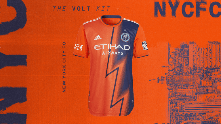
Remember: Scientifically accurate and totally indisputable.
Look, I don’t think this is necessarily the 10th-best looking kit. In fact, it could be the 28th-best. But how could I not take a moment to applaud NYCFC for just going for it here? Like really really going for it. People have been begging MLS teams to take more risks for years. Don’t be upset when a team really, really, really takes a risk. A lot of people are going to have feelings on this one, but enough people will call it their favorite NYCFC kit ever down the line that it will all be worth it. Besides, NYCFC’s primary is so good they deserve a little leeway with the secondary.
9. LA Galaxy - City of Dreams Kit
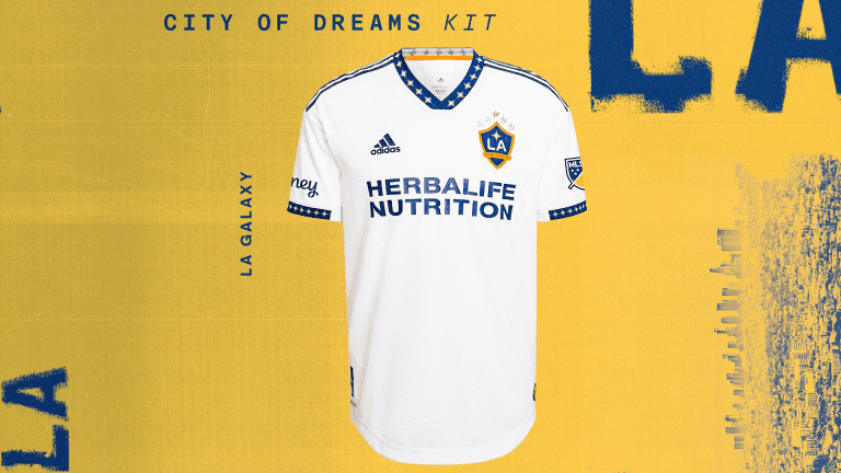
The word “clean” has absolutely no meaning anymore, but I think this kit is somewhat close to what people are trying to describe when they say it. There are simple and well-executed design elements here that elevate the entire product. Essentially, it looks good without being cluttered. I love the trim and the new star design above the crest, even if the overall design is tamer than most of the kits this year.
It doesn’t have to be an abstract art piece to be good. It can be. But it doesn’t have to be. I’m more than ok with straightforward when it comes to clubs building on their established identities with their primary kits. Especially when it’s executed well. Which hey, speaking of…
8. Columbus Crew - Gold Standard Kit
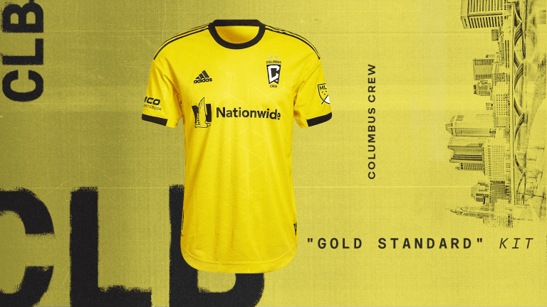
IT’S. GOLD.
Y’all, the bleakness I felt looking at Columbus’ kits last year and seeing a black primary and a white primary. It hurt so deeply. I’ll be honest, they’re getting a ton of bonus points here just for the jersey being the right color. Frankly, it’s definitely not my favorite shirt. But then I saw the new surprise...
LOOKIT THOSE SHORTS!
The gold/black/gold look is phenomenal. And it helps them stand out from Nashville’s all golds. They apparently have yellow shorts for this kit too, but I’m not sure they need them.
7. FC Cincinnati - Juncta Juvant Kit
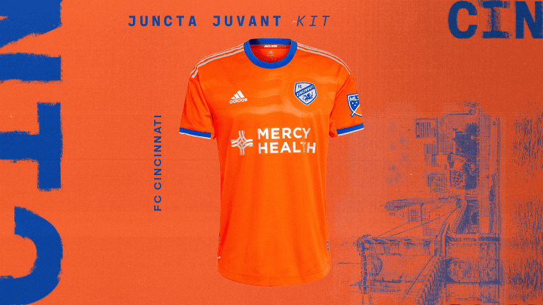
This one fits into a similar category as NYCFC in that I like the risk they took, though I wish they had leaned into it even more. The city flag concept is such a good idea in itself that it probably would have looked even better if they had made it a more prominent feature. Maybe most importantly, FC Cincinnati fans finally got the orange kit they’ve been hoping for.
6. CF Montréal - Secondaire Kit
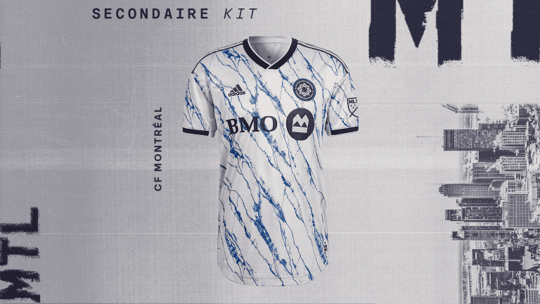
It looks cool. Everyone I’ve shown it to says it looks cool. I don’t know if I have more than that. Sometimes you really don’t need more than that.
5. Philadelphia Union - For U Kit
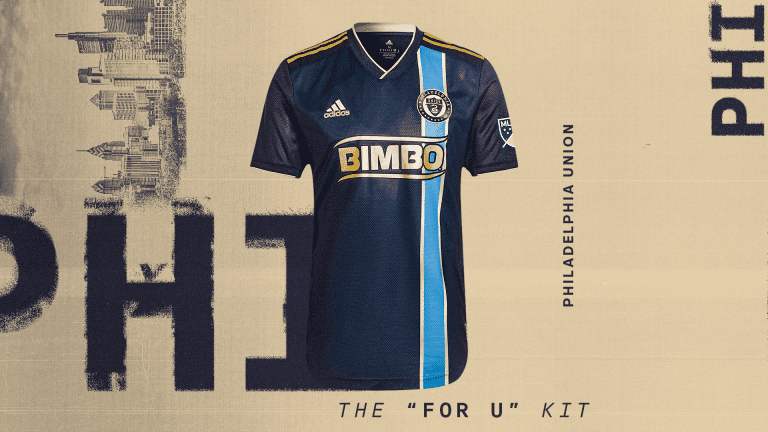
Are we even surprised at this point? The Union dropped their fan-designed secondary kit last season and it instantly became a classic. It’s no surprise the Union’s Creators’ Collective (full disclosure: I’m somehow a member now) came through with a stellar primary.
It’s always tougher to be innovative with your primary and they usually aren’t as high up these kinds of lists because of that. However, the Union get so much right here and take a lot of previous ideas from their past primaries and execute them better.
4. Real Salt Lake - Believe Kit
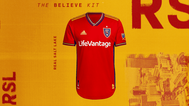
What an absolutely excellent primary kit. RSL’s colors are so good that it’s really hard to mess this up in the first place, but they really stuck the landing here. There’s something that makes it feel like a throwback without it feeling dated or forced. If you can get that feel and retain a distinct identity just by making the correct decisions when it comes to the trim and collar, you’re doing a lot right. It might have been my favorite primary this year. But you’ll see why it didn’t quite get there in a second.
3. Portland Timbers - Heritage Rose Kit
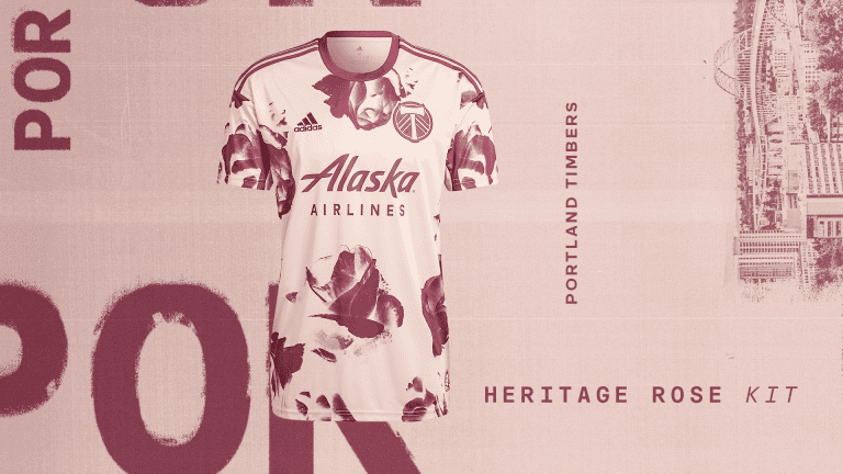
I admittedly kind of recoiled at this one at first but it grew on me very, very quickly. The unique pattern, the connection to the city’s identity, and the overall design make this an A+ quality kit. In past years, it would have been an easy choice for the best and most original in the league. This is not past years.
2. LAFC - 5 Year Anniversary Kit
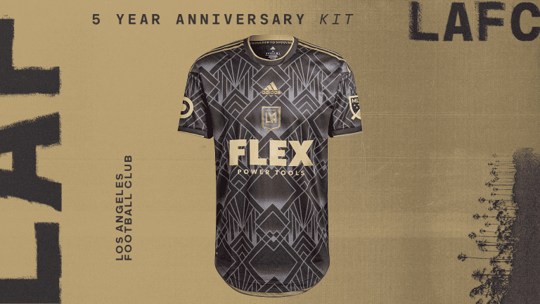
Holy smokes, are you kidding me? I mentioned earlier that it’s tough to truly take risks with your primary, but LAFC went for a full-court shot here and drained it. The art deco pattern and the centered logo put this one in contention to be looked at as a classic years down the line. I genuinely don’t know how they go up from here. They took a straightforward black and gold primary look and made it one of the most unique in the league. That’s enough to elevate this look past Portland’s for me. It just wasn’t enough to get past…
1. Vancouver Whitecaps FC - Hoop x The City Kit
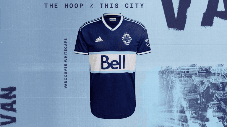
The colors alone would have been enough to make this a really successful kit, but then they went and nailed everything else too. The front hoop matching the primary is a great touch and builds on the team’s identity with an excellent throwback look that comes from the Whitecaps’ history in NASL. Everything about it just works. Even the sponsor looks like it belongs. Sometimes you don’t have to be the most ambitious kit, you can just be the best looking.


