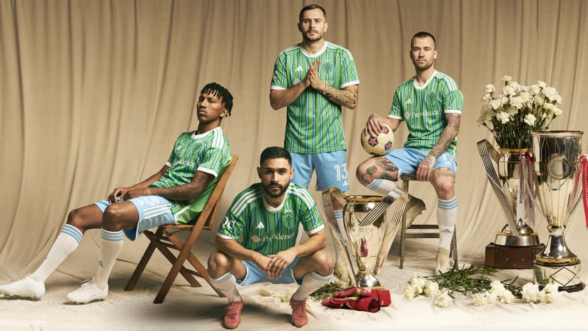
Jersey Week has come to a close. Finally, we’ve gotten a look at each team’s new kit for the very first time. Yes, a week full of surprises everyone was surprised by. How can you not love it?
Anyway, even if we can’t agree on our favorite new looks, I think we can all agree there’s been a positive shift over the last few seasons. Teams are taking bigger swings with their kits. When it pays off, it pays off big. When it doesn’t… well, hey, we’ve gotten to a place where things are far more interesting.
Here are some of the best from the 2024 crop.
Chicago have lept over a low bar by bringing back their red primary look (how did they ever get away from it?) and putting together a modern version of a kit that has a distinctly Fire identity. The light blue accents go a long way here.
This is a kit worth more than peanuts. Good grief, just look at it. You’d be a blockhead not to get it. I’m glad no one felt snoopy and leaked this one early. I’ve gotta feel like the lines for this thing are going to draw a crowd as big as Woodstock. You’re a good kit, The Home Kit.
This one had a high degree of difficulty execution-wise. Those kinds of kits typically take a bit to warm up to, but when it clicks it clicks. That’s where this one ended up for me. If you don’t like it yet, I bet you will soon.
It is really, really hard to mess up a look with LAFC’s colors. Fortunately, no one has even come close to doing it yet. I’m not sure it ranks ahead of the previous Art Deco-inspired kit, but it’s a very, very tight race.
This kit, along with the Loons’ secondary “Northern Lights” kit, gives them an argument for having one of the better kit combos in league history. Both take some big swings, both connect on them and both execute on a relatively central theme. It just works.
The MetroStars had an outstanding look. It only makes sense for the Red Bulls to incorporate as many elements from that look as possible. They’ve done an excellent job here while maintaining a Red Bulls feel. This is their best and most distinct primary look since the mid-2000s.
Another Legacy Kit is fine by me. It’s not even really about the overall look here though; it’s almost exclusively about bringing back the three-headed lion logo from Orlando's USL days. It’s so… let’s call it unique, that it circles back around to being extremely cool.
The Union Creators’ Collective hasn’t missed yet. Some day other teams are going to catch on and let their fans take the reins on the design process. Until then, Philly are going to keep outpacing folks.
Uhhhhh, oh my god? I didn’t know RSL had this in them.
They took a huge risk here and ended up with something that feels instantly iconic. It’s the most unique RSL look ever and it feels like the kind of thing they can build off as part of their identity going forward. It’s that good.
Personally, this is my absolute favorite of the bunch. Seattle knocked their crest rebrand out of the park and then rolled out their best-ever MLS kit. The colorway is elite and the design elements are what people actually mean when they use the word “clean.” It’s so good that they could just stick with this look forever and call it a day.


