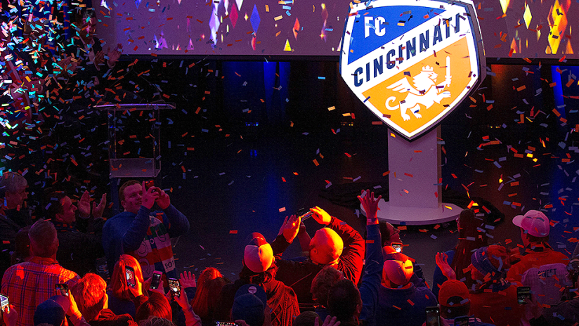
CINCINNATI—FC Cincinnati officially began the shift from United Soccer League club to Major League Soccer expansion franchise Monday with the unveiling of its new logo and brand identity.
The new branding was created in tandem with Interbrand after an intensive three-month process that culminated in early August when it was presented to MLS officials at the 2018 MLS All-Star Game presented by Target.
Cincinnati, which recently completed its third USL campaign, is set to begin play in MLS next season as the league’s 24th team.
“Tonight represents goodbye to our past,” said FC Cincinnati president and general manager Jeff Berding, after the unveiling event. “We're not in the USL anymore. We've been balancing both, and I just saw the movie 'Man on the Moon,' the Neil Armstrong story. What tonight represents is that stage where the rocket ship is going and it loses its booster rocket. We're still shooting to the moon. We've dropped the booster rocket, which was USL.
“I say that with full respect because the rocket doesn't get to the moon without that booster rocket that got it off the launch pad. Tonight represents we don't need that booster rocket anymore.”
With the new branding, Cincinnati will officially change the name from "Futbol" to "Football", rather than the speculated switch to the German word "Fussball", and the crest is an evolution of the former logo, still implementing "The Orange and Blue" and a winged lion, but with some different twists meant to create more ties to the city roots.
Interbrand representatives spent time in the West End neighborhood, where FCC will break ground on a new stadium next month, to come up with some inspiration for the logo. The pentagram outline of the crest hails from various five-sided shapes seen in architecture around the area, and Cincinnati is prominently displayed in the center, going at an angle to represent that it is a “city on the rise,” as club officials often say.
The typography itself is a nod to classic German lettering, tying to the deep German heritage of the city. As for the winged lion to represent the strength of the city, it contains many key details: there's a crown for the “Queen City,” and the seven points of the mane for the seven hills of Cincinnati. The three feathers of the wings are a call to the three years it took to get to MLS, and the curled tail is a “C” to tie back to the city’s name as well.
“We wanted to build that meaning into the mark,” said Interbrand representative Jamey Wagner. “It was really important to the fans, our ownership, to our leaders, but it's still a great mark if you don't know all that.”
Owner & CEO Carl Lindner III said he can’t wait to wear a shirt with the new logo. Fans were already lined up to purchase new merchandise at the unveiling event.
“I absolutely love the logo,” he said. “I loved our old logo, but this is a great evolution, and it's even a better representation of who we are. If you study every little detail of this logo, we had so many great ideas from Interbrand and our supporters, when you bring them all together, we have a logo with so many meaningful features to Cincinnati and who we are, it makes it different than any other logo out there.”


