Style: You either have it or you don’t.
This is true for everything from a midfielder’s pass to David Beckham’s latest adventure in hairstyling. The axiom also applies to soccer jerseys.
An ugly jersey is often resigned to “game-day only” status, worn only out of some sense of obligation to show your support for your team and to not let the $100 you spent on it go to waste.
On the other hand, a well-designed kit has the ability to transcend its role as in-stadium apparel for both fan and player and become a fashion icon.
On any given day in any city, you can cross paths with someone decked out in an England, Brazil or New York Cosmos kit who has no idea who Ashley Cole, Júlio César or Giorgio Chinaglia are. It’s not the nation nor the team that appeals to them, but something simpler: the look.
And so, on the day the Montreal Impact get set to unveil their 2012 debut MLS jersey to the world, we look back at three of the best-looking jerseys to grace the league since its inaugural season of 1996.
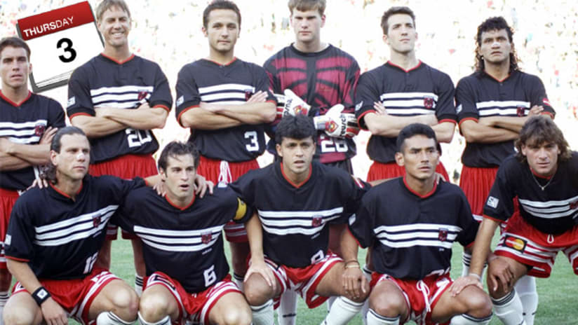
D.C. United, 1996 home jersey

In the early years of MLS, there was no club more revered than D.C. United and there was no other kit in the nascent league that looked so old-school.
A predominantly black affair with red accents on the collar and cuffs, the jersey’s single button and blocky numbers on the bottom-right of the front made it look classic from Day 1. And who could forget the three white stripes cutting across the front?
LA Galaxy, 2007 home jersey

In the summer of 2007, Beckham came to America in part to help change the perception of MLS. That may have taken the five full years of his contract to accomplish, but one change that he brought about immediately was a completely new look for the Galaxy.
Gone was the jarring green and yellow color scheme and unique-to-MLS sash. In its place was a clean, white kit with a floppy blue collar and a Herbalife logo framed by a pair of serpentine gold accents. And if you were one of the more than 300,000 people who picked up that kit that year, there’s a good chance it bore No. 23 on the back.
Vancouver Whitecaps, 2011 away jersey

Fittingly, one of the league’s newest clubs boasted the freshest look of 2011. Vancouver’s white home jersey was as natty as they come, but it was their away kit that was the real head-turner.
With its almost invisible pattern drawn from the shape of the club’s logo and near-iridescent deep sea blue color, the Whitecaps away kit is like no other jersey in the league, past or present. That’s somewhat apropos for a club with a rich NASL/USL history that’s firmly focused on its MLS future.


