ST. PAUL, Minn. – After many months of speculation, Minnesota United fans rejoiced as they were told they get to keep their team name on Friday.
After media reports and widespread conjecture that the club’s name would change with the move to MLS, owner Dr. Bill McGuire confirmed that the club would still be known as Minnesota United FC when they officially join MLS in 2017, prompting thunderous applause from the 1,500 fans in attendance at the announcement event at CHS Field, home of the local amateur baseball club the St. Paul Saints.
The crowd broke into an impromptu “We Are United, Never Divided” chant as their fears of losing their branding, which has become a point of pride in recent years, were resolved.
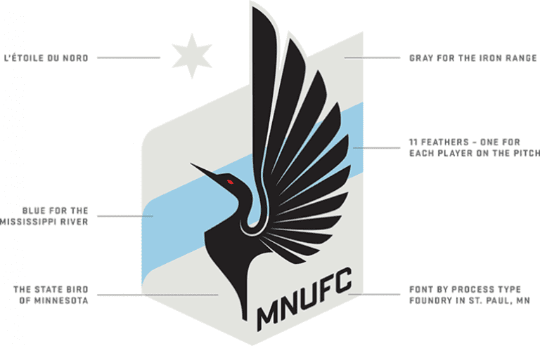
The club will also keep their “loon” crest, albeit with some slight alterations. The crest was cleaned up, most notably changing the letter-art in the crest from “Minnesota United FC” to “MNUFC.” The crest, designed by local design firm Zeus Jones, features a loon with 11 feathers, to represent the 11 players on the pitch. The blue streak in the middle represents the Mississippi River (which starts in Minnesota), a gray backdrop for the state’s Iron Range and the North Star above it all.
After fans read what they believed to be confirmation in March media reports that their team would have to change names (thought to be to “Minnesota FC”), they responded with a public outcry. The Dark Clouds, MNUFC’s primary supporters group, posted an open letter saying they opposed, but would follow the team no matter what. Meanwhile, many more fans took to Twitter, voicing their displeasure and hoping the league would allow the name to remain.
“There was a rationale for the name,” MLS Commissioner Don Garber said on Friday. “They’ve had so many different names over the last 40 years. At first we thought the United name was just another attempt at the traditional name movement that has been happening in our league.
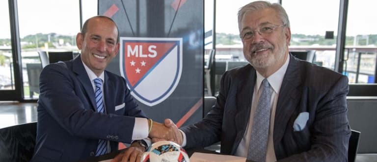
“The more time we spent with [majority owner] Bill McGuire and [club president] Nick Rogers – and we even started talking to some fans – we realized this is a club that’s going to unite these two cities and a stadium that bridges the city in the Midway. We then put aside what we at the league thought might be best and ultimately agreed with their approach.”
Garber explained that the decision was made with the long term in mind.
“In sports you want to make sure names have a uniqueness that can last forever,” he said. “What is the best name for this club for the next 40 to 50 years? We did research, we hired a local branding company, and we came up with something we are really excited about."
While some MLS fans may worry that having three teams with a "United moniker could confuse neutral fans, it’s easy to point to the structure in England, where five clubs in the top two professional flights are branded as United. Each club has been able to form their own identity and distinguish themselves from the rest, and the same should be the case when Atlanta United and Minnesota United join D.C. United next season.
It’s hard to separate the current organization from the name, as MNUFC technical director Manny Lagos explained.
“The name has become part of who we are and what we are doing with this organization,” Lagos said. “It was hard not to allow us to keep the name, sort of like it would have been hard for them not to allow a soccer-specific, grass-field stadium in this community. I don’t think it could have gone any other way at this point.“
Currently, the club wears a dark gray jersey with a black wing on the front as their primary kit. Their secondary kits are described as “sky blue,” while their third alternates are white with a pale blue sash on the front, a color pallet that would be unique to MLS. According to the club, there isn’t an estimated time in place as to when their 2017 jersey designs will be released.
Jeff Rueter writes for FiftyFive.One. You can find him on Twitter at @jeffrueter.


