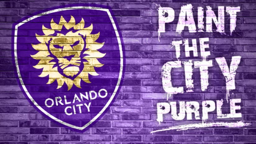
Orlando City SC have taken another major step forward in their transition to MLS with the unveiling of their new club crest.
The sharp purple-and-gold shield was created by David Brotherton, a graphic designer who also happens to be an OCSC season-ticket holder, and it was the winning entry in an open competition that drew more than 30 submissions from 10 different design agencies.
“To concept the identity [for] a team and a city of mine and to actually know that that's going to be the emblem for the club that you're going to cheer for, that you feel so passionately about and have been watching for three or four years, as a soccer fan … it gets no better,” Brotherton told the Orlando Sentinel. “I'm still pinching myself right now.”
The new crest features an updated version of the club's lion mascot, stylized in a nod to Florida's “Sunshine State” moniker and ringed by 21 sunbursts representing Orlando's status as the 21st MLS club. The lion wears a subtle crown symbolizing last year's USL PRO championship.
OCSC's signature purple hue remains, and will anchor the rollout of the new logo, which will feature in seven murals splashed on buildings around Orlando as OCSC and their fans “paint the town purple.”
- Learn more about the new logo at OrlandoCitySoccer.com
The new look provides a stirring reminder that the Lions are now less than a year away from their first MLS action.
“I like clean and classic looks and I think it's something that'll stand the test of time,” OCSC coach Adrian Heath told the Sentinel. “I think in the future when we look back, this is another one of those monumental days along the way.”


