Whenever your first glimpse of the Philadelphia Union comes in 2018, you're almost certain to notice something considerably different.
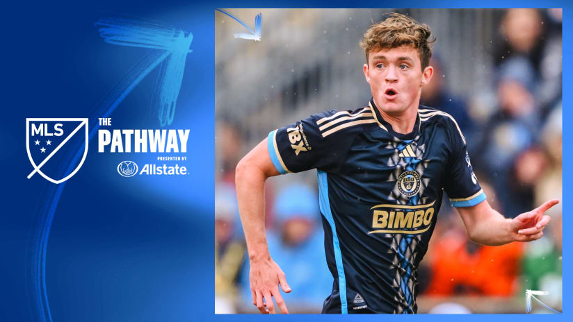
The Union have gone away from their traditional vertical gold bar in their new home kit, and have also unveiled a refined club badge and logo that you'll see some form of on every piece of new Union gear.
The reason for that is simple, says club vice president of marketing Doug Vosik. When the team consulted its supporters about the issue, they voiced a readiness for change.
"One thing we heard a lot from them is that the club had grown over eight years, specifically on the sporting side as well," Vosik said. "And as they saw all these changes happening, they hadn’t seen a lot of change that excited them about how we look."
The Union are not the only MLS team to have departed from a traditional look over the years while still keeping the same club identity.
D.C. United bore three horizontal stripes on their home jerseys over their early MLS seasons. Since their rebrand, FC Dallas have moved away from the horizontal red-and-white striped look on their home kits. Both the LA Galaxy and Colorado Rapids have endured multiple color scheme changes before arriving at their current identities.
In comparison, the Union's shift may be a more incremental one. But it''s one the front office didn't take lightly.
"It was a big deal to remove that gold bar off the front of the jersey," Vosik said. "But when we were doing all those fan panels, one thing they kept saying to us is we want something new on our home kit."


