WASHINGTON—DC United revere tradition: the very word is printed on the back collar of their home jerseys. And they do so with good reason, given the four MLS Cups and 13 total pieces of hardware in their trophy cabinet.
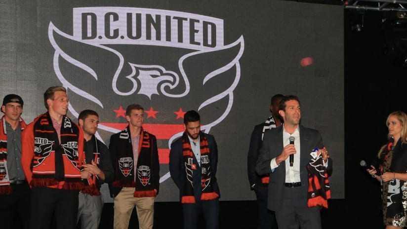
But the Black & Red took a significant step in a new direction on Thursday night, as a packed room of United fans were officially introduced to the club's new logo at hip Union Market in Northeast DC.
As attendees sipped United-themed cocktails like “Black & Red Spirit” and “The Moreno” (a Moscow Mule-inspired tribute to legendary DC striker Jaime Moreno), chief operating officer Tom Hunt explained the thinking – and months of market research – behind the updated crest, along with the new era it portends ahead of the club's move to their own soccer-specific stadium in 2018.
"Other teams around here are Washington; we are DC, and we are United,” Hunt said. "We believe that there is connective tissue that binds what takes place on the pitch with all the diverse and special communities that surround us. To be United is to connect with something greater than yourself.”
The District of Columbia government has nearly completed the land acquisition process for United's long-awaited new home at Buzzard Point in Southwest DC, and the club believes it's time to connect with the people who will hopefully fill that future venue.
“About 18 months ago we embarked on some research to better understand what our brand health was in the market was,” Hunt told MLSsoccer.com, as fans lined up to peruse a wide array of on-sale gear with the new logo.
“Obviously we were well aware of all the trophies we've won and the fans we've had in the past, but the truth is, we need to develop a new fan base moving forward. When you look at our season-ticket base and we start to think about our new stadium, we've got to get to 12- to 13,000 season ticket holders – so we've got a lot of work to do.”
- VIEW GALLERY: #NewDCU Crest Unveiling
Hunt and his colleagues sought the expertise of The Red Peak Group, a design and branding firm which has worked with a range of major clients like American Express, Intel and the Hard Rock Cafe, as well as Peter Horridge, a renowned British typographer who has worked on recent badge redesigns for Liverpool FC and the English FA.
The finished product features a more dynamic eagle mascot and drops a soccer ball image in favor of a three-star, twin-striped element taken from the District flag, which was inspired by George Washington's family crest. It will adorn the redesigned 2016 United home kits, to be unveiled at a season-ticket holder event on February 6. The road whites that made their debut in 2015 will sport a holographic version of the new badge next season.
The new look was warmly received by those present, who also gave a loud welcome to DC's newest acquisition, Lamar Neagle, as he joined head coach Ben Olsen, 2014 MLS Goalkeeper of the Year Bill Hamid and several other United players on stage.
- Find more Black & Red news at DCUnited.com
Whether as a player, assistant coach or head man, Olsen has worn the previous badge for his entire professional career, and remains virtually the club's only present link to the glory days of yesteryear. He, too, has embraced the updated look.
“It's completely grown on me over the last four or five months,” Olsen said. “It's great, I think the message of evolving with this club is important: Not only as a club, [but] with the new stadium coming. I'm an interesting perspective to this whole deal, because I'm a part of the tradition, and the past. And I still think it's important for this club to move forward – the future is really bright with this club.
“Life goes on, man. It evolves. It moves forward.”

