If you didn't know Toronto FC were a Canadian side, there won't be any doubts in 2013.
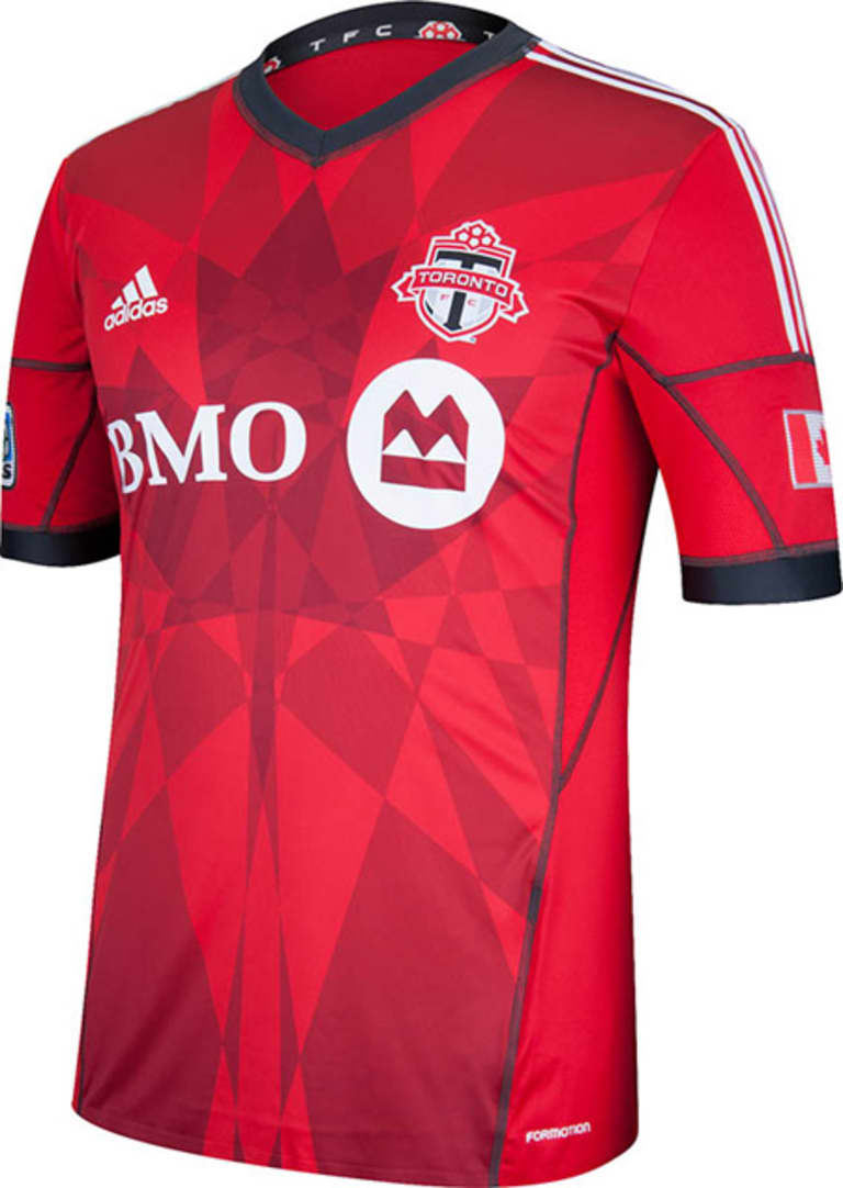
The club unveiled its new primary kit on Tuesday and the new feature immediately jumps out at you: the Canadian maple leaf, made up of geometric shapes meant to represent the multiple parts of the organization, including the supporters.

The 2013 shirt was revealed during a private kickoff party held at the Berkeley Church as part of the first edition of MLS Jersey Week.
PHOTOS: Rapids make waves with two new kits
"One of the great things in talking with the ownership group about what this jersey should be, and what they want it to be, they were interested in how can we communicate with the fans that they all make up part of the team itself," said adidas product manager Mike Walker. "So we came up with this great design where there's different geometric shapes that come together to create a maple leaf on the front of the jersey which is what they're traditionally known for."
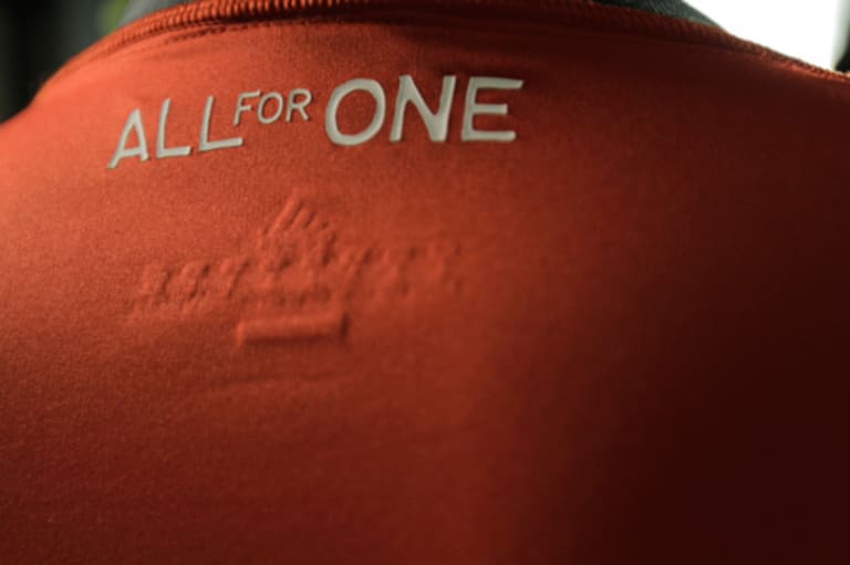
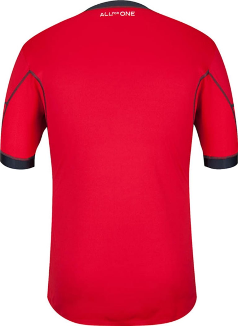
Another feature: the club slogan "All For One" is highlighted on the back of the kit, which fans can pre-order by clicking here. The club will maintain the same secondary kit from 2012.
PHOTOS: Red Bulls going lightweight with 2013 jersey
Supporters with a keen eye will also pick up on the slight difference in the colors compared to past editions of the primary kit.
"They're updating their colors a little bit to incororate that new color of the new red and the new gray and bringing it together into really an artistic kit that still is their traditional red – they are the Reds – and brings that to life."
2013 TORONTO FC PRIMARY KIT (FRONT)

2013 TORONTO FC PRIMARY KIT (BACK)


