The possession percentage statistic is perhaps the most beaten horse across the soccer analytics community. And, it undoubtedly deserves to be.
It has been shown in leagues across the world that teams that happen to "win" the possession percentage battle do not win games at a significantly higher rate. In fact, in MLS, we see that teams that "lose" the possession battle tend to win at a slightly higher rate.
From a 1,000-foot view, this is blatantly counterintuitive. The team that has the ball more often should have more scoring opportunities. And teams that have more goalscoring opportunities should win more games.
But, similar to other soccer metrics measured in this data age, the possession percentage statistic often lacks an appropriate dose of context. But it can yield more useful and tangible nuggets if we break down possession geographically.
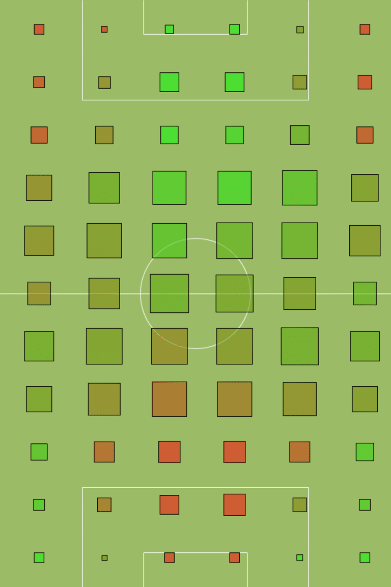
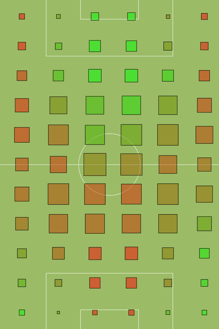
For example, let's take last year's San Jose Earthquakes, the 2012 Supporters' Shield winners. The volume of each square in the chart below represents the number of events that took place in that specific area for both San Jose and their opponents combined. The color of each square represents the percentage of possession they maintained in that zone. The higher the Earthquakes' percentage possession, then the brighter the green, while the darker the red is an indication that the opposing team was dominant (lower half is attacking zone).

SAN JOSE EARTHQUAKES (2012)
And, compare that to the New England Revolution in 2012:

NEW ENGLAND REVOLUTION (2012)
While on the season both San Jose and New England had relatively similar possession rates, it becomes evident which team scored more goals after comparing the two charts.
San Jose managed to maintain possession in the attacking half for a significantly greater amount of time (more green squares than red). By narrowing down the possession percentage focus to the attacking half of the field, it becomes clear that teams that have more possession in the attacking half score more goals (San Jose's 72 vs. New England's 39 goals in 2012). It's quite simple, really.

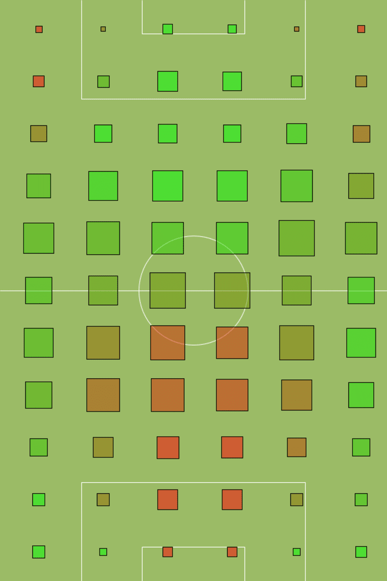
SPORTING KANSAS CITY (2012)
This kind of geographic visualization of the possession game is also useful for identifying different styles of play and tactical systems across the league.
Check the event diagram for Sporting Kansas City last year (above) and notice how their preferred tendency to attack down the wings gives them more green colored boxes down the flanks than San Jose or New England.

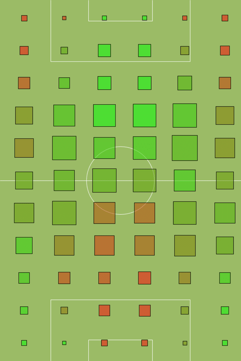
REAL SALT LAKE (2012)
Lastly, we see this snapshot of Real Salt Lake and you can almost see Kyle Beckerman's locks between those bright green squares on top of the defensive third. His ability to retain and distribute possession for Real Salt Lake is crucial to their success.
In soccer, as in all sports, context is important for statistcis. And, even with a popular stat like possession, it's all about location, location, location. We should never lose sight of that.


